This bar chart shows the income and expenditure (in crores of rupees) of a company during 5 years from 2014 to 2018.
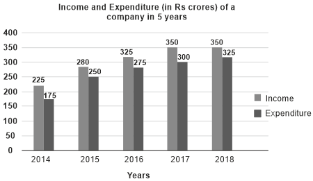
In which year the ratio of income and expenditure is the highest?
Show answer & explanation
Correct answer: B
Explanation
The correct answer is option 2 i.e. 2014.
According to the given graph,
Ratio of income and expenditure for 2014 = 225 : 175
⇒ 9 : 7 ≈ 1.28
Ratio of income and expenditure for 2015 = 280 : 250
⇒ 28 : 25 ≈ 1.12
Ratio of income and expenditure for 2016 = 325 : 275
⇒ 13 : 11 ≈ 1.18
Ratio of income and expenditure for 2017 = 350 : 300
⇒ 7 : 6 ≈ 1.16
Ratio of income and expenditure for 2018 = 350 : 325
⇒ 14 : 13 ≈ 1.07
Hence the required answer is 2014.